Web design trends at a Glance

With over 1 billion websites on the internet, making yours stand out is essential. Your website should not only catch the eye and set itself apart from the competition but also appeal to users. However, it’s not just about design – user-friendliness also plays a key role in shaping the overall user experience.

Web design is a specialized branch of media design that encompasses all strategies for creating a website. It is distinct from web development, which focuses solely on technical aspects. A web designer prioritizes users and their needs, which is crucial because web design directly impacts the user experience. The more engaging and well-structured a website is, the longer visitors are likely to stay.

A company’s website is often the first point of contact for potential leads – so making a strong first impression is essential! Users decide within seconds whether to stay on a site, which means that first impressions play a critical role in showcasing usability. High-quality web design, well-structured content, and carefully chosen typography all contribute to a positive user experience.
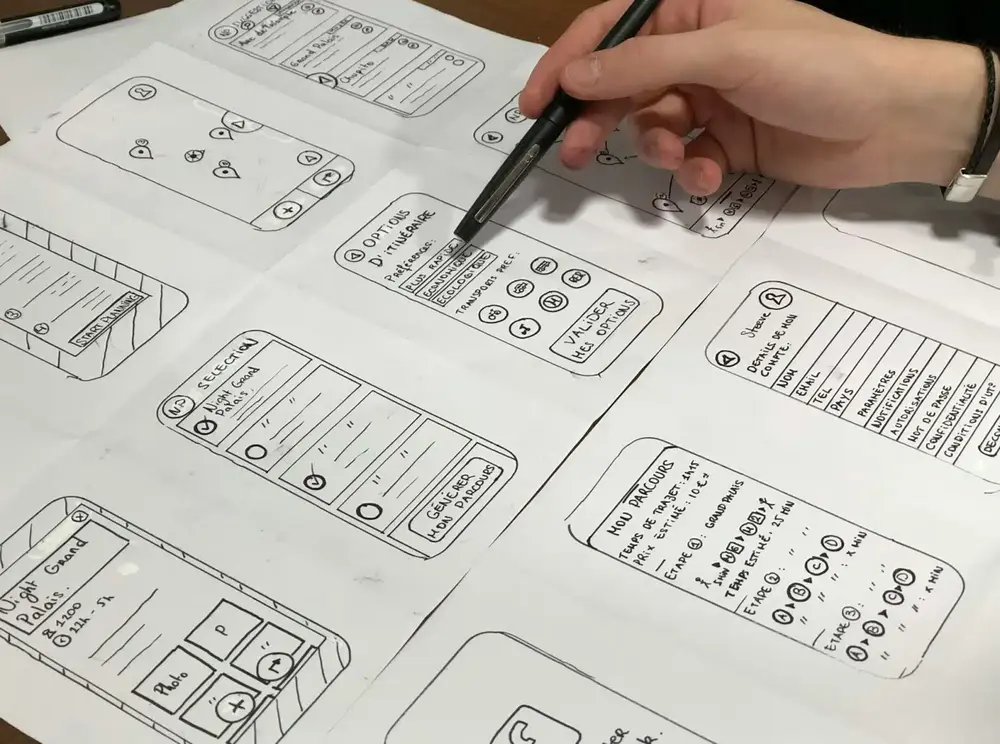

The basics of contemporary web design

  • Simplicity
    Users seek information and actions, not just design. Simplicity is key: limit color palette to 5 colors max, use maximum 2 readable fonts, purposeful graphics only. Avoid unnecessary elements - focus on quick goal achievement through clean, functional web design.
  • Visual hierarchy
    Guide users to key features through strategic element arrangement. Visual hierarchy naturally directs attention to most important content and actions. Effective organization achieves your business goals through intuitive user flow and clear priority structure.
  • Simple navigation
    Avoid confusion: intuitive navigation prevents user abandonment. Include footer navigation, search function, breadcrumbs (except homepage). Limit depth to 3 levels maximum. Clear navigation structure ensures users quickly find needed information.
  • Uniformity
    Consistent design across all pages using your chosen colors/fonts/graphics. Define page types with distinct layouts for brand recognition. Cohesive visual identity strengthens professional appearance and user familiarity throughout website.
  • Conventions
    Follow established web standards users expect: main navigation top/left, logo upper-left (clickable to homepage), hover effects on links. Familiar conventions reduce learning curve and improve immediate user comprehension and interaction.
Responsive design: optimization for mobile devices is essential

You can find it in any statistic or even in your own analytics data: internet users primarily browse the web via mobile devices, from tablets and small laptops to smartphones. Therefore, it’s crucial to optimize your website for mobile devices. This means creating a responsive web design that ensures your website looks great on smartphones, laptops, tablets, and desktop screens.

Responsive design is the approach to web design where web content is adjusted to fit various screen and window sizes across a range of devices. This design approach allows multiple layouts of content and design to be displayed on different devices, depending on the screen size.

A clear distinction is made between responsive design and adaptive design. Responsive design adjusts the display of a single page version, while adaptive design delivers different versions of the same page based on the screen size. With responsive design, users access the same base file through their browsers, and the CSS code controls the layout, rendering it differently based on the screen size. In adaptive design, a script checks the screen size when accessing the website and then loads the template designed for the specific device.

Mobile traffic has now surpassed desktop traffic, accounting for over 51% of website visits. Therefore, never overlook responsive design. It’s best to adopt a mobile-first approach and design your mobile version before the desktop version.

Current trends in web design

  • User experience #1 reference
    UX remains web design's primary goal beyond visual appeal. Integrate voice, multimedia, information architecture for future-proof interfaces. Voice search innovations demand solid architectural foundation anticipating command-only navigation.
  • AI chatbots & generated images
    AI chatbots surge: structure content for chatbot processing, plan input/output strategically. Use DALL·E, Midjourney, Stable Diffusion for visuals. Wix Studio's AI design features shape future. Information architecture becomes crucial.
  • Unusual layouts
    Unique, creative layouts dominate: AI enables Renaissance effects, minimalism variations. Rigid text-image layouts vanish. High-contrast color palettes replace monochrome. Web design competition returns fun through endless creative possibilities.
  • Maximalism
    Lights off, spotlight on: eye-catching graphics, bold colors, expressive typography. "More is more" philosophy thrives on striking visuals evoking positive emotions. Maximalism evolves everywhere - web design and consumer goods alike.
  • Retro trend
    Roots with modern twist: 80s/90s aesthetics via "Beyond Y2K" movement. VHS effects, Memphis design, grainy textures, vintage photography return. AI generates patterns/animations for authentic retro inspiration effortlessly.
  • Manga & hyperfeminine
    Cute kawaii aesthetic explodes: hearts, bows, butterflies, manga elements. Playful Japanese style surged since 2023, captivating younger audiences. Designers embrace creativity, reinterpretation opportunities extensively.
  • Pastel colors
    Dark mode fades: soft pink, light blue, mint, lavender, peach revive web design. Pastel palettes breathe modern life despite less eye comfort than dark themes. Gentle tones evoke soothing viewer emotions effectively.
  • Oversized controls
    Giant buttons, extra-large menus combat shrinking attention spans. Social media information flood demands bold attention-grabbers. Ultra-enlarged menus omit images entirely, forcing exploration of website areas creatively.
  • Endless scrolling & parallax
    Parallax scrolling creates depth illusion, virtual storytelling via scroll effects. 3D product animations leverage cinematographic techniques. Endless scrolling immerses users like Facebook/Pinterest - fast, engaging, interaction-free.
  • Glassmorphism
    Transparent blurred surfaces create depth: Flat vs 3D Glassmorphism. Neumorphism evolution uses semi-transparent layers, frosted glass effect. Bold colors, subtle gradients, rounded corners, soft shadows define modern aesthetic.
  • Split Screen
    Split screen divides into magazine-style vertical halves. Visually appealing side contrasts content side endlessly. Perfect for innovative topics/projects. Simple concept, infinite creative implementations across web.
  • Natural shapes
    Curves, waves, flowing lines connect technology with nature. Calming, familiar aesthetic contrasts geometric rigidity. Natural forms in headers, icons, buttons convey liveliness, humanity, emotional resonance powerfully.
  • Animated elements
    Interactive microinteractions enhance UX: hover animations, sliding menus, fade-ins. Animated GIFs capture attention instantly. Small effects spark enthusiasm without visual clutter when used sparingly and purposefully.
  • Pop-ups
    Love-hate relationship persists: pop-ups grab attention consistently despite annoyance. Use sparingly with clear purpose/incentives (discounts, new products). Design visible close icons for mobile-friendly user experience.
  • Vibrant gradients
    Bold gradient comeback: buttons, backgrounds, text adorned with intense/subtle hues. Colorful gradients add depth, visual separation. Creative themes embrace intense contrasts; subtle pastels enhance usability elegantly.
  • Dark Mode
    Elegance + sustainability: dark backgrounds save energy, enhance usability. Sophisticated touch prevents brightness overwhelm, encourages scrolling. Dual benefit achieves style and environmental responsibility simultaneously.
  • Accessibility
    Accessibility evolves from trend to requirement: legible fonts (200% scalable), high contrast, image alt-text, video subtitles, clear structure. WCAG AA+ compliance ensures disability-inclusive navigation and content access.
  • Alternative navigation
    Experimental navigation breaks conventions: animated effects, innovative interactions. Creativity welcome but avoid overwhelming users. Balance experimental design with intuitive usability for positive user experiences.
  • Diversity over standardization
    Individualized elements replace cookie-cutter layouts. Colors, fonts, imagery diversity plus inclusion, cultural sensitivity, dynamic content define modern web design character comprehensively and authentically.
  • Playful overlapping text
    Text gets playful over images/elements: clever overlaps highlight important information aesthetically. Harmonious design placement creates visual interest while maintaining excellent content readability and hierarchy.
  • Brutalist minimalism
    Minimalism meets brutalism: raw textures enhance simple elements. Architectural movement origins emphasize bold simplicity. Large text, few images define rough yet refined aesthetic perfectly balancing both trends.
  • Text-focused minimalism
    "All eyes on content": pure text minimalism eliminates visual distractions. Clear typography structures information effectively. Excellent for blogs/informative content - natural eye flow to essential messaging directly.
  • Material Design
    Flat design evolves: material design adds depth via shadows, gradients, microinteractions. Prominent surfaces replace solid colors. Modern look enhances UX through sophisticated visual hierarchy and interactive feedback.
  • Soft focus
    Photoshop Gaussian blur inspires web design: subtle background blur creates ambiance. Perfect when lacking high-quality images - combines elements beautifully. Trend transforms image editing tool into complete design system.
  • Vintage aesthetics
    Serif fonts, typewriter styles, earth tones, sepia effects evoke analog era. Paper/wood textures, hand-drawn illustrations, B&W photography complete nostalgic look. Timeless appeal despite state-of-the-art alternatives.
  • Geometric shapes
    Building block simplicity: striking, rational geometric shapes remain classic. Versatile decorative/content structuring elements. Moderation prevents overly technical appearance while maintaining strong visual impact.
Should you chase every trend?

A new year, a new article about current web design trends – that’s the norm. However, if you track these developments over the years, you’ll quickly notice that many of these so-called trends are often just repeats or aren’t really trends at all. And let’s not forget: a trend is a development, and it can quickly stagnate, become irrelevant, or disappear.

Even if you tend to raise an eyebrow at these trendy articles (but hopefully not ours!), they exist for a good reason. After all, as is the nature of trends, they influence the web designs of many websites. So, to avoid falling behind, web designers should definitely stay informed about what’s trending or currently hot and keep an eye on the development of these trend waves. And if you’re riding that trend wave, you’ve got a modern website – could be worse, right?

But despite the hype, always take it easy with the new trends! Stay informed, but make sure to evaluate their applicability to your corporate identity before planning a new website relaunch every year.

Explore Codafish’s 2023 Web Design Trends
Contradictory trends showcase design possibilities and potential for individualization

Minimalism vs. maximalism, retro design vs. vintage, flat design vs. skeuomorphism – contradictory trends in web design that seem to oppose each other yet attract one another!

The combination of extremes and the creation of a visual tension field are more popular than ever, as they open up a wide range of new creative possibilities. After all, there’s no need to strictly choose one side. Instead, designers are free to harness the best of both worlds and create something unique. Experimentation and flexibility take on a whole new significance, effortlessly breaking down old conventions.

At the same time, the courage to embrace new ideas, demonstrated through the use of contradictory trends, propels the potential for individualization to new heights. Designers and companies now have the opportunity to develop their own identity and craft a unique brand personality. The combination of contrasting trends can create a distinctive visual language that sets a brand or product apart. By integrating different styles, target audiences can be addressed more consciously. This approach often allows companies to shape the spirit of the times and present a bold, visionary image through the interplay of contrasts.

Is the idea too bold for you? Take another moment to think about it – after all, these design contradictions are pure gold! Above all, due to their unbeatable ability to grab attention, unusual and unique designs tend to stick in people’s minds. And why do they stay with us? Exactly – because they emotionally engage users on multiple levels.

Conclusion: the most important trends in 2025

These are the key web design trends for this year! In conclusion, stay informed about the latest developments. If you’re looking to refresh your website, it’s recommended to blend timeless design trends with the latest technology trends. As you’ve seen, AI and accessibility, among other things, are becoming increasingly important and should play a continuous role in your website.

You should make space for minimalist elements in the visual design, as they continuously play an important role in various iterations of current trends.

“Are you planning a relaunch, find several trends appealing, and need support with implementation, especially regarding technical aspects? Then we are the right partner for you! As a digital agency, we cover your needs from A to Z: We provide comprehensive consultation, and our art direction team will create a design tailored to your specific wishes and needs. But we don’t stop there: We’ll build your website according to your preferred concept, ensuring that the latest technology trends are integrated. Book your free consultation online today – we look forward to working with you!

Let's get in touch

With us, you have one partner for all your digital needs. From strategy and consulting to development, marketing and ongoing support, we help you build, connect and optimise your digital systems. We work with you from the initial idea through implementation and beyond, supporting your digital transformation every step of the way.

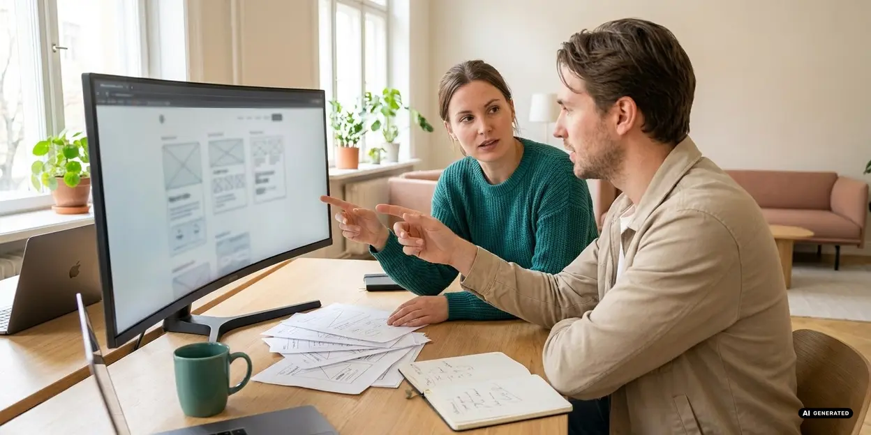
Office workers communicating and working at desks

codafish ><> your digital agency

+1 888 9263234

hello@codafish.net

Feel free to contact us for a free initial consultation. We’d be happy to hear from you!

The data provided will be transmitted in encrypted form and treated in accordance with the data protection law. You can find our data protection information here.

talking talking-dark
chatting chatting-dark
star-1
star-2
arrow-1

Create digital growth that fits your business.

From strategy to SEO, development and support – let's build it together.

Don’t hesitate to call us for a free initial consultation. 30 minutes, with no obligation. We’ll be happy to speak with you! +1 888 9263234