Contact
Get in touch with us so that we can create a digital project after a free initial consultation and work out a roadmap together.
Learn more

A company’s website is often the first point of contact for potential leads – so making a strong first impression is essential! Users decide within seconds whether to stay on a site, which means that first impressions play a critical role in showcasing usability. High-quality web design, well-structured content, and carefully chosen typography all contribute to a positive user experience.
Web design trends are constantly evolving, so it’s important to stay updated. However, beyond the latest trends, there are timeless fundamentals that remain essential for any design. That’s why you should always keep the following key factors in mind!
Of course, web design should be visually appealing, but that’s not the most important factor. Users don’t visit a website just for its design – they come to find information and complete specific actions. Since they want to reach their goal quickly, simplicity is key. While visual appeal matters, unnecessary design elements should be avoided.
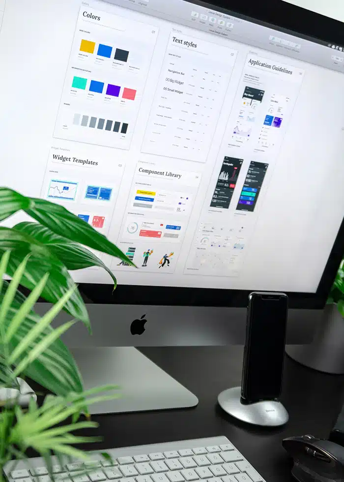
To design your website with the “keep it simple” approach in mind, start by limiting your color palette to a maximum of 5 colors. When it comes to fonts, avoid going overboard. What might look unique to some can appear cluttered to others. Stick to a maximum of 2 fonts and ensure they are easy to read. Graphics are also a great way to enhance your design, but make sure they serve a purpose – whether that’s aiding in a specific action or fulfilling a functional role.
You set the tone on your website and know exactly where you want to guide your users to achieve your goals. To be successful in this, you should follow the principle of visual hierarchy, arranging and organizing your website elements in a way that naturally draws users to the most important features through effective web design.
The worst-case scenario for web design is confusing users and/or presenting content in a way that’s unclear. In that case, the visitor will leave faster than you can blink! That’s why it’s crucial to have intuitive navigation on your website. This helps users quickly find what they’re looking for.
To ensure easy navigation, a navigation function should be included in the footer of every page, and a search feature should be integrated. Additionally, breadcrumbs should be used on every page except the homepage, so users can always orient themselves during their visit.
A good structure is important, but don’t overwhelm your users with too many options. Remember: navigation should not go deeper than three levels.
Feel free to design your website using the colors, fonts, and graphics of your choice, but ensure that the overall appearance remains consistent across all pages. All elements should have a cohesive design. If you define different types of pages, these should be linked to distinct layouts to create brand recognition.
Designs, trends, and services – all of these are constantly evolving in today’s world. However, there are certain web design conventions that most users have been familiar with for many years and that have become second nature. These user learnings and fundamental principles for web designers should definitely be considered and implemented.
At the top of this checklist is the rule that the main navigation of a page should always be placed either at the top or on the left. Logos should also be positioned in the upper-left corner and be clickable, allowing users to return to the homepage with a click. Furthermore, links should change color or appearance when users hover over them, making them easily recognizable as clickable.
You can find it in any statistic or even in your own analytics data: internet users primarily browse the web via mobile devices, from tablets and small laptops to smartphones. Therefore, it’s crucial to optimize your website for mobile devices. This means creating a responsive web design that ensures your website looks great on smartphones, laptops, tablets, and desktop screens.
Responsive design is the approach to web design where web content is adjusted to fit various screen and window sizes across a range of devices. This design approach allows multiple layouts of content and design to be displayed on different devices, depending on the screen size.
A clear distinction is made between responsive design and adaptive design. Responsive design adjusts the display of a single page version, while adaptive design delivers different versions of the same page based on the screen size. With responsive design, users access the same base file through their browsers, and the CSS code controls the layout, rendering it differently based on the screen size. In adaptive design, a script checks the screen size when accessing the website and then loads the template designed for the specific device.
Mobile traffic has now surpassed desktop traffic, accounting for over 51% of website visits. Therefore, never overlook responsive design. It’s best to adopt a mobile-first approach and design your mobile version before the desktop version.
Let’s get down to the nitty-gritty! After all, if you’re aiming to design modern websites, it’s essential to stay on top of the latest web design trends.
Web design trends focus on both design and technology. We’ve compiled a mix for you here that brings together the top trends from both areas.
No matter what you’re doing, user experience is the primary goal of any web design. However, we’ve reached a point where design can no longer focus solely on visual appearance to make it engaging for the user experience.
From now on, voice, information, and various multimedia elements should be seamlessly integrated to create a cutting-edge web design from a technological standpoint. With the rise of voice search and other innovations, the ideal interface of the future will function solely through voice commands, eliminating the need for a traditional visual interface. Therefore, web design should be built upon a meticulously crafted architectural foundation.
Surprise! The trending topic of artificial intelligence is here to stay. AI chatbots, in particular, are on the rise. When it comes to web design, this means that input and output options must be carefully considered and strategically planned during development. If your chatbot is designed to interact with your website’s content, it is essential to structure the content in a way that allows the chatbot to process and utilize it effectively. In this context, information architecture plays a crucial role.
At the same time, it is essential to determine which types of content should be made accessible to AI. Additionally, AI can be leveraged for the flexible creation of illustrative visuals. Tools like DALL·E, Midjourney, Stable Diffusion, and Adobe Firefly can assist you in this process.
AI technology is increasingly making its way into the realm of content management systems. For example, Wix Studio now offers AI-powered web design features in its editor. These developments are already shaping the future, where AI will play a crucial role in discussions and decisions regarding design and technology. As a result, designers will continue to explore both the potential and limitations of AI, honing their skills along the way.
Once again this year, the more unique and creative the layout, the better! As mentioned earlier, web designers are exploring endless possibilities with AI: from effects and a return to Renaissance styles to minimalism in all its forms, and much more. Websites are taking on all shapes and colors, fueled by the creative freedom that designers now have.
The rigid text-and-image layout is no longer the norm. New interpretations are flooding the World Wide Web, bringing the fun back to the competition! Gone are the days when monochrome was limited to grayscale – now, all color palettes are in play, creating high contrasts to make the central message stand out.
Lights off, spotlight on – eye-catching graphics, bold colors, and expressive typography! True to the motto “more is more,” maximalism thrives on striking visuals and vivid hues that evoke positive emotions. One thing is certain: this web design trend will keep evolving, as it’s everywhere – whether in web design or consumer goods. This has already set a certain expectation in the design community: designers are encouraged to continuously seek out or create new style elements to flood the market with fresh ideas.
Back to the roots, but with a modern twist: that’s how this web design trend can be described! Retro design will continue to be a strong trend in the coming years. Other eras, such as the 80s and 90s, will be increasingly embraced as part of the “Beyond Y2K” design movement. Classic patterns from these decades, a VHS aesthetic, and Memphis design blend seamlessly with contemporary styles. Grainy background textures, soft monochrome gradients, vintage photography, and classic magazine layout techniques are also making a comeback. The retro trend has a lot to offer the user’s eye! If you’re struggling to get started or need fresh inspiration, AI can be a great resource, helping generate patterns and animations.
Cute, glittery, and hyper-feminine: that’s the kawaii aesthetic, which is gaining more and more popularity. This Japanese style embraces a playful vibe, featuring elements like hearts, bows, butterflies, and more. Since 2023, the look has surged in popularity, bringing something fresh and exciting to the world of web design. The manga-inspired elements woven into the kawaii aesthetic complete the look perfectly. This trend isn’t just popular with users; it’s also a hit among designers, offering even more room for creativity and reinterpretation. It especially appeals to younger audiences!
For a long time, the world of web design trends was in the dark: black designs dominated, giving websites a sleek and modern touch. But good news: color is back – with pastel palettes! Soft pink, light blue, mint green, lavender, and peach blend together beautifully. Admittedly, it may not be as easy on the eyes as the once-popular dark mode, but it brings new life and a modern vibe to web design trends. The gentle tones also evoke emotions in the viewer, thanks to their soothing effect.

Various studies, along with our own personal experience, show that in the age of social media and push notifications from news apps, we are increasingly flooded with information. As a result, the attention span of internet users is shrinking. What’s needed now is a bold design move to stand out from the crowd – such as the rise of giant buttons and extra-large menus!
Why is the focus on oversized buttons still a trend? Quite simply, because it works! Since they can’t be overlooked, these buttons immediately grab attention. When paired with the trend of ultra-enlarged menus – where images are entirely omitted – the effect is even stronger: these design elements are impossible to ignore! It’s also a refreshing experience, as what were once purely functional elements are now creatively reinterpreted. Another nice side effect is that these “extra-large” menus encourage users to explore other areas of the website.
Endless scrolling and scroll effects
Another trend for 2025 is the scroll effect, more specifically parallax scrolling. This technology scrolls foreground and background content at different speeds, creating the illusion of depth and adding vibrancy to the website.
Combined with scroll-based animation effects, parallax scrolling primarily creates virtual storytelling, offering users an interactive experience – especially because it takes full advantage of the screen size. Parallax scrolling leverages cinematographic techniques like slow zooms, 3D rotations, and long tracking shots, which is why it’s often used for 3D product animations. After all, what customer wouldn’t be excited to view products in 3D on an e-commerce site?
In addition to parallax scrolling, endless scrolling is also gaining attention from designers, as it creates a truly immersive scrolling experience for users. Once visitors reach the end of a page, new content is automatically loaded, allowing them to absorb information in bulk – unlike standard layouts. The best examples of this are Facebook and Pinterest, where visitors don’t need to interact and are kept engaged, making the trend fast and user-friendly.
Combine transparent surfaces with a modern aesthetic, and you have another web design trend: Glassmorphism! By using blurred backgrounds and transparent layers, it creates an illusion of depth and transparency. This design trend distinguishes between flat Glassmorphism and 3D Glassmorphism.
Flat Glassmorphism builds on the Neumorphism trend, which combines minimalist design with realistic surface effects. Flat Glassmorphism takes this a step further by using semi-transparent surfaces, causing the elements behind them to appear blurred. This creates the impression of frosted glass. Key features of this effect include bold colors, subtle gradients, rounded corners, soft shadows, and light reflections.
With 3D Glassmorphism, spatial depth is intensified, making it an essential element. Above all, it gives every website a modern and stylish look!

Back to standard layouts – or not! The split screen is a relatively new web design trend. The focus is on dividing the screen into two vertical halves, giving the design the feel of two pages in a magazine.
Despite the simple description, the term “standard” can be removed from the definition, as it simply doesn’t apply. This is why many different implementations can be found across the web: often one side is visually appealing, while the other side displays the content. The possibilities are endless! In terms of content, the split screen approach is especially suited to innovative topics and projects.
Natural shapes are the web design trend that connects technology with the environment in 2025! Design elements like curves, waves, and flowing lines evoke shapes found in nature, creating a calming and familiar aesthetic. Whether in headers, backgrounds, icons, graphics, or button designs, these natural forms stand in contrast to strict geometric shapes. They convey liveliness and humanity, as their natural associations have the power to evoke emotions.
Despite a slight dip in popularity, animated and interactive elements have made a strong comeback. They play a crucial role in web design trends and are now indispensable on websites. Even small effects are enough to spark enthusiasm among users.
Popular elements include hover animations on mouseover, such as simple color changes, mobile menus that slide in when you click the hamburger icon, and text blocks or images that fade in. Microinteractions – subtle effects and animations – can greatly enhance UX by simplifying navigation. However, caution is needed! Larger animations should be used sparingly, as they risk creating visual clutter.
Another popular feature is animated GIFs, which have become a staple in everyday life thanks to social media. These small animated sequences, often showcasing snippets from films or videos, immediately capture the user’s attention simply because they move.
Pop-ups, pop-ups everywhere – and no escape! Admittedly, some users have developed a bit of a love-hate relationship with pop-ups, but they are still very much on trend. Despite being increasingly annoying, they manage to do one thing consistently – grab our attention. And in doing so, website operators have already achieved their goal. This success has spread, which is why pop-ups continue to be so popular.
So, don’t be afraid to embrace this trend in web design, but keep in mind: it’s best to use pop-ups sparingly, as they can reduce user-friendliness, especially on mobile devices. Additionally, always ensure pop-ups have a clear purpose or, even better, offer an incentive. Information about new products or discount promotions will delight every website visitor! And always follow the golden rule for designing the close icon: make it as visible as possible so users can find it quickly!
In the world of web design trends, color gradients have made a big comeback and are here to stay. Whether it’s buttons, backgrounds, or large text – all are commonly adorned with color gradients, ranging from subtle hues to gradients in various tones. This trend is implemented in different variations. While some web designers opt for bold colors, others go for more subtle pastel shades. In the latter case, the gradient may not be the main focus, but it adds depth to the design and can enhance usability by providing a clear visual separation.
Intense color gradients stand out boldly, which is why they should be used with caution – except for creative themes, where they fit perfectly.
In general, whether intense or subtle, the more colorful the gradients, the livelier your website will be!
Whether in fashion, automotive design, or web design, black symbolizes elegance and style. This is exactly why designers still favor dark mode for backgrounds and elements. But it’s not just for artistic reasons – sustainability plays a big role as well. Dark backgrounds use less power than light ones, so dark mode achieves two goals at once. On the one hand, it gives the website a sophisticated touch and enhances usability (after all, users are more likely to keep scrolling when they’re not overwhelmed by brightness). On the other hand, by saving energy, you’re also contributing to environmental protection.
One topic that is still considered a web design trend but will soon become a requirement is accessibility. In this case, design takes a backseat, with the focus shifting to the technical components that enable users with disabilities to fully navigate the website. Therefore, when designing your site, you should prioritize making it accessible to everyone. The key to this is a combination of usability and accessibility. The foundation is ensuring that your site has a clear structure and intuitive navigation.
First and foremost, ensure that you use legible fonts and that the font sizes are large enough. It should also be possible for the user to adjust the font size as needed. A scalability of 200% is the basic requirement. Additionally, make sure there is sufficient contrast.
Technology can do a lot on its own, but it still cannot see or describe images. Therefore, it’s essential to enrich your images with as much information as possible. Add a title and description so that screen readers can interpret and convey the image to the user. If you include videos on your website, be sure to add subtitles or provide the corresponding transcripts.
To ensure your content is easy to read and understand, it should have a clear text structure with headings, paragraphs, and simple language.
If you need further information or assistance, you can find all the accessibility requirements in the WCAG guidelines (Web Content Accessibility Guidelines) and use them as a reference. For full accessibility, Level AA or higher is recommended.
The classic navigation structure we just recommended is currently being broken by web design innovators, with the goal of creating a new experience for users on the website. The result is animated effects and innovative interactions. As a result, these designs are often labeled as experimental. However, be cautious: what may seem entertaining and exciting to some can be overwhelming and not user-friendly to others. So, the motto is: YES to creativity and breaking away from standard layouts – but please, don’t overdo it.
The world is diverse – and this is increasingly reflected in web design trends. Standard layouts and cookie-cutter elements aren’t just being discarded in favor of diversity in design but completely replaced with individualized building blocks and elements. And that’s the right approach!
Diversity on websites is defined by a variety of colors, fonts, and imagery. But that’s not all: inclusion, accessibility, attention to cultural nuances in graphics and text, and dynamic content all shape the character of this web design, ensuring a high degree of individualization. In short: you can have it all when you think beyond the boundaries of the standard!
When you get creative with web design, you can also have fun! In the latest web design trends, it’s not just design elements but also text that gets playful, especially when combined with images. Overlapping text on images or other elements is a trend that captivates. The key lies in the clever design and placement of these overlaps – after all, they need to create a harmonious and aesthetically pleasing result!
The web design trend not only looks great but is also an excellent way to highlight important information, offering a lot of creative design possibilities.
Minimalism has been enjoying success for years with its understated design and is also very popular outside of web design. However, this year, minimalism is a wolf in sheep’s clothing – brutalism is trending!
Brutalism also focuses on simplicity with few elements but emphasizes rough textures that enhance the minimalist accents. Few images and large text are just one of many examples.
To fully understand the web design trend, it’s important to know its origins: The raw aesthetic is derived from the Brutalism architectural movement, which emphasizes boldness and simplicity.

Another trendy form of minimalism in web design puts the text in the spotlight: in this approach, everything revolves around the motto ‘all eyes on content’ – you won’t find any visual elements here, as the focus is entirely on clear, minimalist text content.
There isn’t much experimentation with the font either: clear typography is used in this trend, which supports or even creates structure. A key advantage of this website presentation is the simple and thus effective communication in UX: by reducing images, elements, and graphics, the user’s eye is naturally drawn to the content. As a result, text minimalism works excellently for informative content and blog posts.
Two-dimensional flat design is a thing of the past. Or rather, material design has made its way back into the trends! Thanks to material design, the simple, solid-colored surfaces we knew from flat design are replaced by larger, more prominent surfaces, enhanced with subtle shadow effects. This depth effect greatly improves the user experience.
The use of material design requires shadows, gradients, and microinteractions – small, targeted animations within the user interface. The visual elements of the design are valued, but don’t be fooled: while material design will give your website a modern look, that’s all it does.
When a popular tool from Adobe Photoshop meets web design, voilà – a new trend is born. And the star of the show is the Gaussian blur! No longer limited to image editing, it has now become a basis for creating entire web designs – all in a subtle manner.
The effect is primarily used on background elements to create a pleasant ambiance, allowing it to subtly play behind the content. The blur trend is especially useful if you don’t have high-quality images, as individual elements can be beautifully combined.
Vintage never goes out of style, which is why this trend continues to appear in web design. Serif fonts, typewriter fonts, the iconic earth tones, and the sepia effect evoke memories of a time when digitalization was still far off. What’s also worth mentioning with the vintage trend are the signature graphic elements that feature various textures like paper, wood grains, and fabrics.
The attention to detail is also reflected in hand-drawn illustrations, which are often combined with geometric patterns. Ideally, the website’s look is completed with vintage photography, aka black-and-white photos.
Admittedly, vintage is always eye-catching, but it’s also something you’ve seen a thousand times before – and unfortunately, it has little to do with state-of-the-art design.
We continue our list of web design classics that always make it to the top rankings. Proudly presenting: geometric shapes, like those from a building block set, that never go out of style!
Striking and rational – that’s the effect geometric shapes create in designs. And they’re incredibly versatile! Whether used simply as decorative elements or for the structured arrangement of content. However, to position your website effectively within the design world, it’s important not to overuse shapes, as too many can quickly make the design appear overly technical.

A new year, a new article about current web design trends – that’s the norm. However, if you track these developments over the years, you’ll quickly notice that many of these so-called trends are often just repeats or aren’t really trends at all. And let’s not forget: a trend is a development, and it can quickly stagnate, become irrelevant, or disappear.
Even if you tend to raise an eyebrow at these trendy articles (but hopefully not ours!), they exist for a good reason. After all, as is the nature of trends, they influence the web designs of many websites. So, to avoid falling behind, web designers should definitely stay informed about what’s trending or currently hot and keep an eye on the development of these trend waves. And if you’re riding that trend wave, you’ve got a modern website – could be worse, right?
But despite the hype, always take it easy with the new trends! Stay informed, but make sure to evaluate their applicability to your corporate identity before planning a new website relaunch every year.
Minimalism vs. maximalism, retro design vs. vintage, flat design vs. skeuomorphism – contradictory trends in web design that seem to oppose each other yet attract one another!
The combination of extremes and the creation of a visual tension field are more popular than ever, as they open up a wide range of new creative possibilities. After all, there’s no need to strictly choose one side. Instead, designers are free to harness the best of both worlds and create something unique. Experimentation and flexibility take on a whole new significance, effortlessly breaking down old conventions.
At the same time, the courage to embrace new ideas, demonstrated through the use of contradictory trends, propels the potential for individualization to new heights. Designers and companies now have the opportunity to develop their own identity and craft a unique brand personality. The combination of contrasting trends can create a distinctive visual language that sets a brand or product apart. By integrating different styles, target audiences can be addressed more consciously. This approach often allows companies to shape the spirit of the times and present a bold, visionary image through the interplay of contrasts.
Is the idea too bold for you? Take another moment to think about it – after all, these design contradictions are pure gold! Above all, due to their unbeatable ability to grab attention, unusual and unique designs tend to stick in people’s minds. And why do they stay with us? Exactly – because they emotionally engage users on multiple levels.


